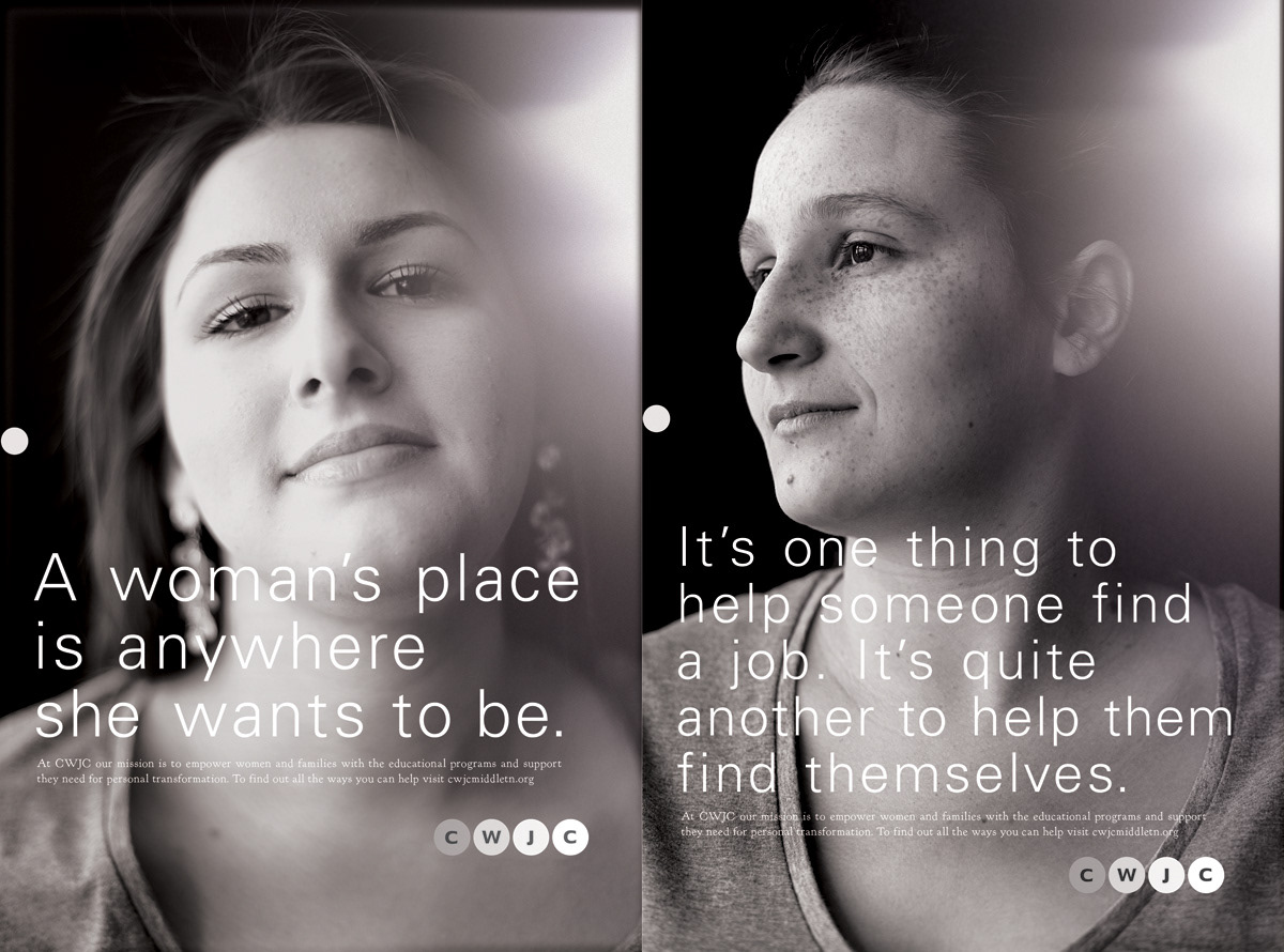
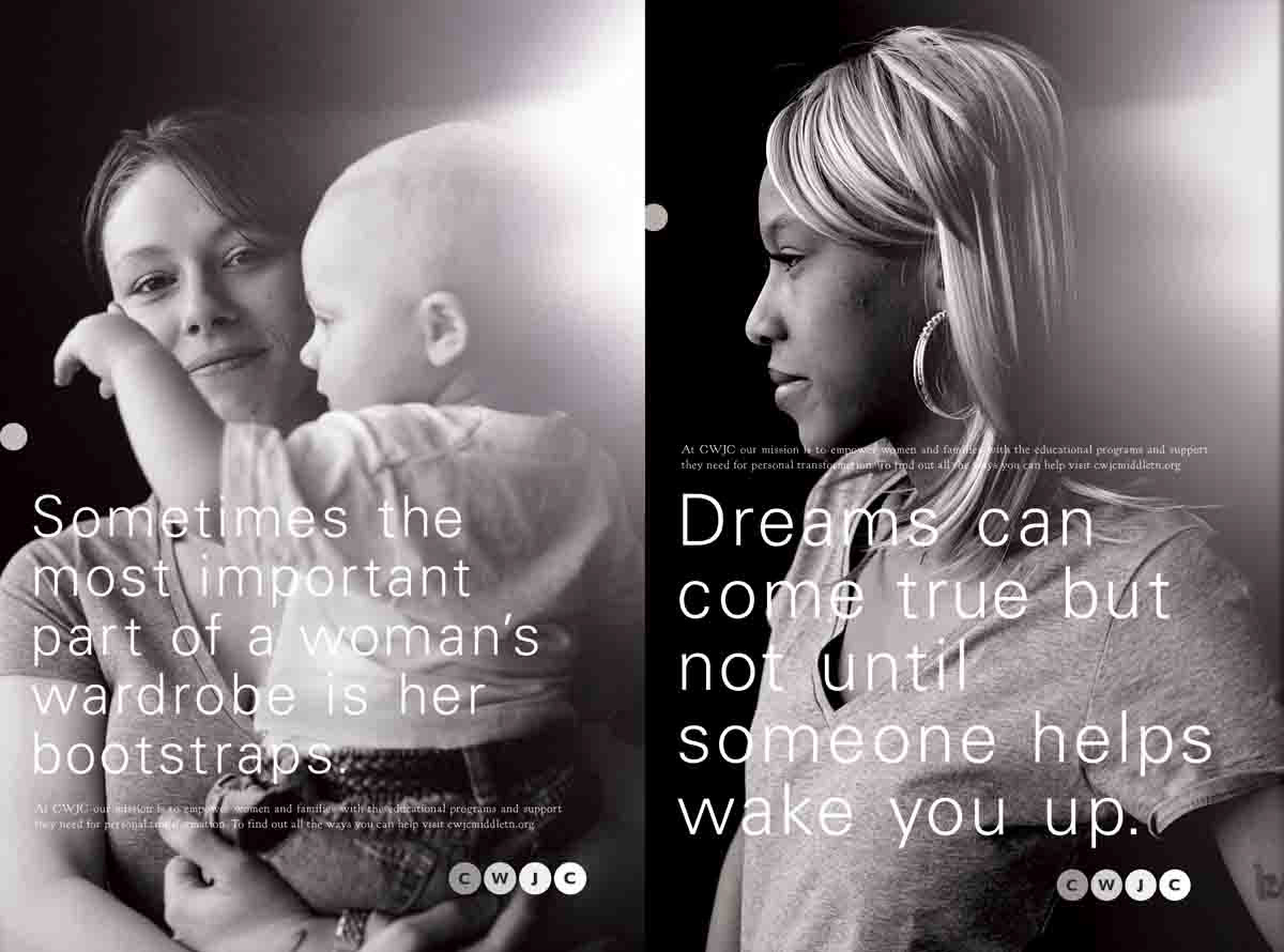
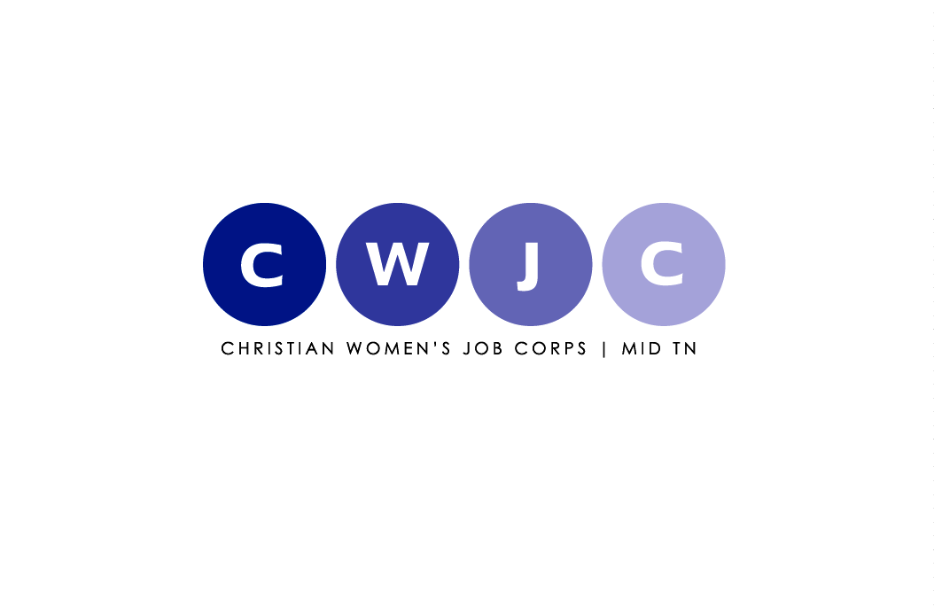
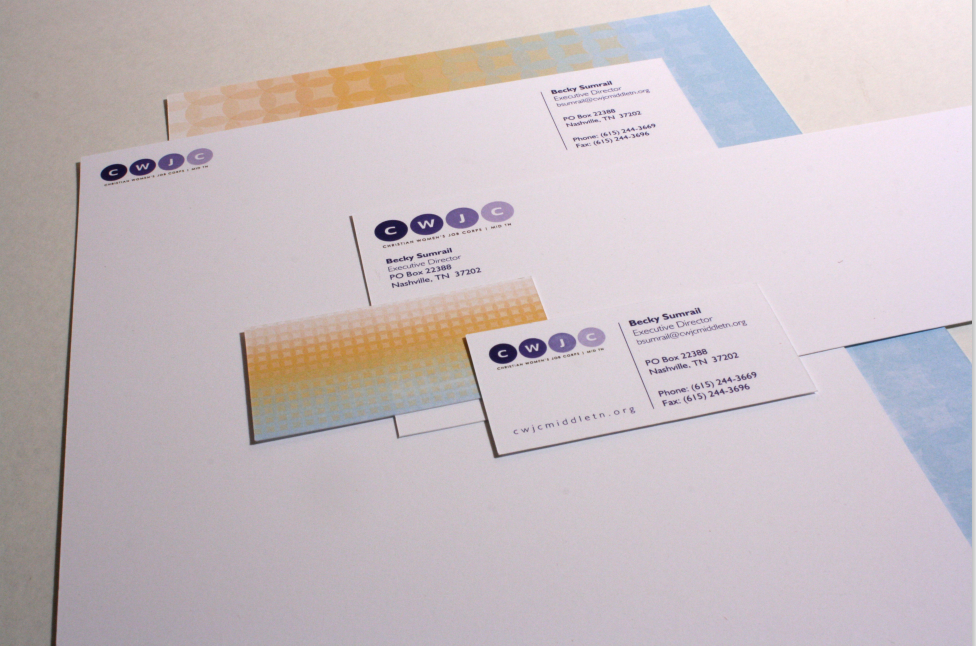


The identity for Christian Women's Job Corps, TN was built around the concept of optimism. Within the logo a gradation from dark to light can be seen — giving the graphical insinuation of coming out of the darkness into the light. The super graphic was an expansion of this idea into color, creating a dawn effect with the staple circles from the mark. The idea of light is again portrayed in the poster series to relay the concept of optimism and hope. Photographer: Tibor Nemeth, Art Director/Designer: Hart Armstrong, Mark Arnold, Copywriting: David Smith